Project Insights
JFrog Apptrust project-level dashboard, metrics, and insights
Project Insights gives you a project-level view of application health across your project in JFrog AppTrust. You can use this page to understand how your applications deliver, where policy checks fail most often, and where security issues create the highest operational risk.
This dashboard brings together key DORA metrics such as Deployment Frequency and Lead Time for Changes, and critical intelligence such as Top Reasons for Failure and Blast Radius, so you can monitor trends, spot outliers, and prioritize the actions that improve delivery and reduce risk across the project.
Filters
You can use the filters at the top of the page to display Insights data relating to certain applications in the project and specific time frames. The filters include:
- Maturity Level: Includes applications with maturity levels: Unspecified, Experimental, Production, End of Life.
- Business Criticality: Includes applications with business criticality: Unspecified, Low, Medium, High, Critical.
- Labels: Includes applications that have any of the labels you choose.
- Time Period: Includes data from the last seven days up to the last full year.
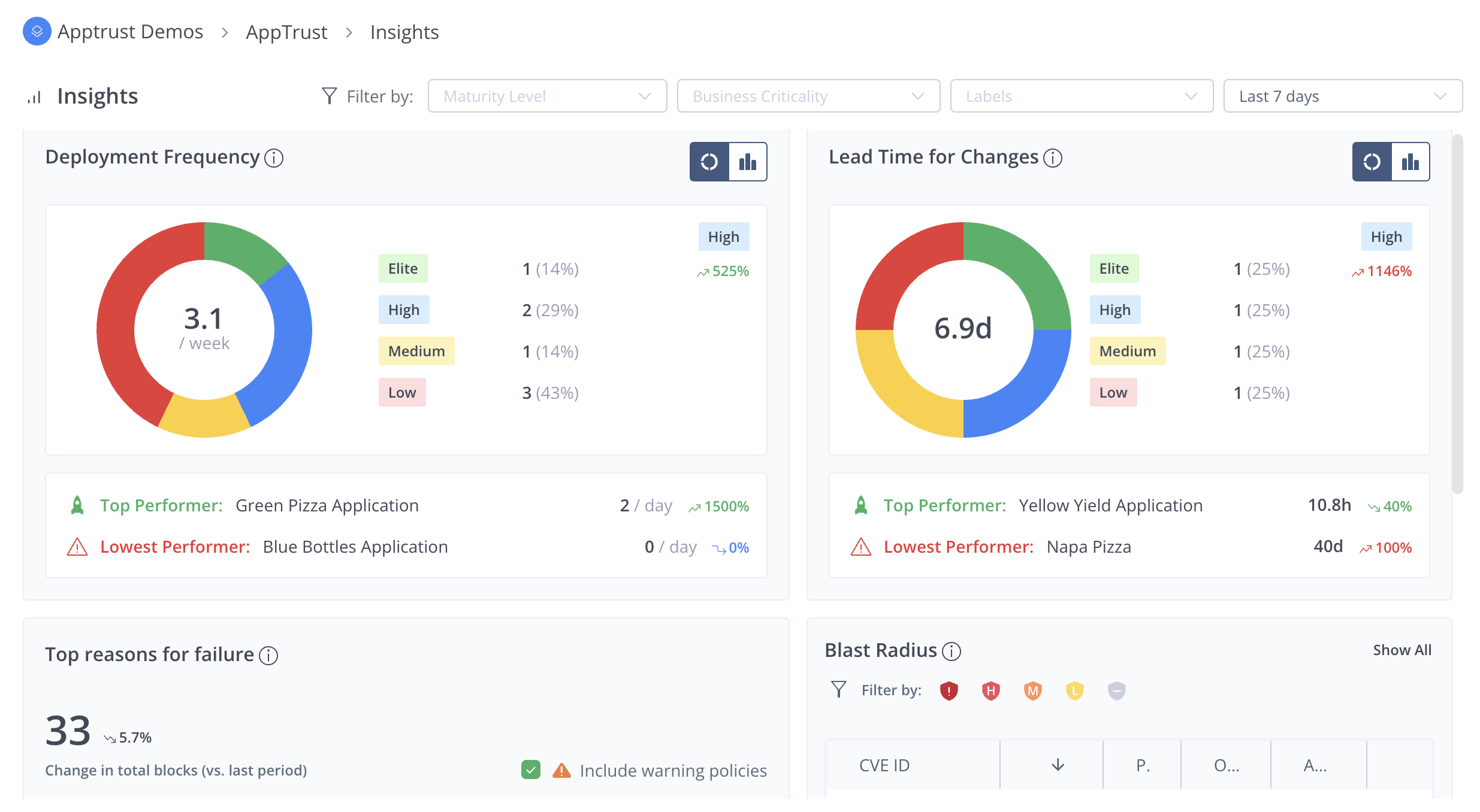
Deployment Frequency
The top left panel shows a key DORA metric, how often applications in a project deploy. The display uses an application-balanced project score, so that one high-volume application does not hide slower applications in the project.
The metric displayed is the average application deployment frequency. To get this average, the deployment frequency per application is calculated, then the frequencies of all the applications are averaged. This gives each application an equal weight.
The panel includes the DORA badge (Elite, High, Medium or Low) for the score and a trend indicator versus the previous time period.
You can display the data in two different views:
- Donut View: Number of applications falling into each DORA tier (Elite, High, Medium, Low) based on each application’s deployment frequency.
- Chart View: Bar chart of daily release activity across the selected period. The chart visualizes the total releases per day across all applications to show overall cadence and day-to-day rhythm.
A footer highlights the application with the highest deployment frequency (top performer) and the application with the lowest deployment frequency (lowest performer), including applications with zero releases.
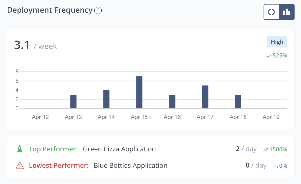
Lead Time for Changes
The top right panel presents another DORA metric, how quickly work typically moves from change to production. The data is for the project as a portfolio of applications. Typical Application Lead Time is the median of each application’s own median lead time, so each application is weighted equally. The project score drives the DORA performance band and can be viewed over time or by how applications spread across bands.
The panel shows the project’s typical lead time (for example, days), the DORA badge for that score, and the trend versus the prior time period.
You can display the data in two different views:
- Donut View: Number of applications that fall into each DORA tier (Elite, High, Medium, Low) when each application is classified from its own median lead time. This is useful for spotting a concentration of slow or fast applications.
- Chart View: A line chart over the selected period. Each point is the median lead time of all releases on that day, so you see whether the delivery pace is stable or shifting from day to day.
A footer calls out the application with the lowest median lead time (fastest typical delivery) and the application with the highest median lead time (slowest typical delivery) in the project.
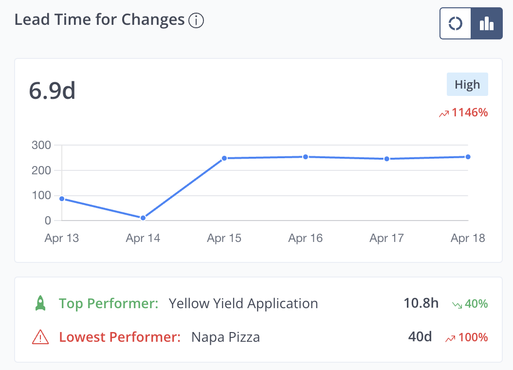
Top Reasons for Failure
This panel shows the top five policy rules that create the most delivery friction across the project by aggregating policy evaluations from all applications and lifecycle stages. Top Reasons for Failure ranks rules by how often evaluations end in Fail (and optionally Warning) so you can prioritize the biggest recurring blockers.
The panel displays the total number of failed evaluations in the selected period, the trend versus the previous equivalent period, and a checkbox to include warning policies.
The panel shows the top recurring rules (up to five) as cards, each with category icon, rule name, evaluation count, and percent share of total failures. Rules are grouped project-wide by rule name and sorted by highest count first.
The display counts evaluations across the full lifecycle (for example, Dev, QA, Staging, Prod) within the selected time window, using evaluation-level granularity. One promotion can contribute multiple rule failures.
Blast Radius
Blast Radius helps you answer portfolio-level security questions in JFrog AppTrust: which issues create the most production risk across the applications in a project, and where those issues land across packages, applications, versions, and stages.
In the project level insights, Blast Radius aggregates vulnerability context across applications in the project.
The Blast Radius feature requires integration with JFrog Xray.
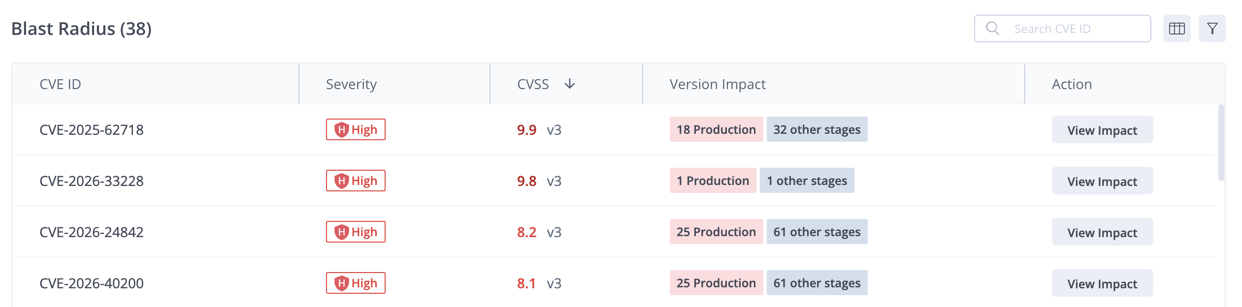
The default view of the table shows the top seven CVEs according to the calculated CVSS scores, with 10 being the most critical CVE.
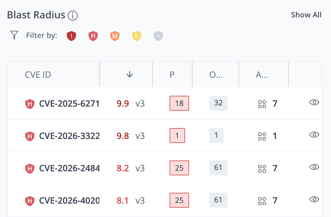
The Blast Radius table includes the following information:
- CVE ID: The code identifying the vulnerability or exposure and an icon indicating the severity.
- CVSS: The score according to the common vulnerability scoring system and the CVSS version. The following scoring ranges are used: Low (0.1–3.9), Medium (4.0–6.9), High (7.0–8.9), and Critical (9.0–10.0).
- Prod: The number of application versions on Prod that have the vulnerability or exposure.
- Others: The number of application versions in other (non-prod) lifecycle stages that have the vulnerability or exposure.
- Apps: The number of applications in the project that have the vulnerability or exposure. Hover over the number to see a list of the applications.
- View Impact (eye icon): Click the eye icon to see detailed information about the impact of this CVE.
Show All
To open the full-size Blast Radius table, click Show All in the upper right corner of the Blast Radius area. This table shows the full list of CVEs and the same information about each CVE.
Impact Details
To see the full impact of a CVE, click the eye icon in the overview table or View Impact in the full view table.
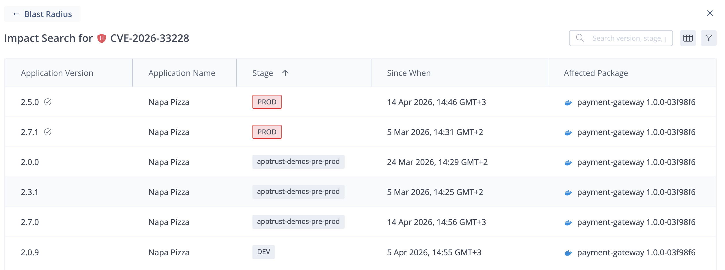
For the specific CVE, the Impact Search table shows the following information:
- Application Version: The version of each impacted version.
- Application Name: The name of the impacted application.
- Stage: The current lifecycle stage of the impacted version.
- Since When: The date and time when the version was promoted to its current lifecycle stage.
- Affected Package: The name and version of the affected package. When there are multiple packages affected, hover over the name to see a list of the packages.
- Package Owner: The application bound to the affected package. When there are multiple affected packages bound to different applications, hover over the number to see a list of the bound applications.
Updated about 1 month ago